Use style tiles to jumpstart your project’s graphics process
Style tiles are a great way to understand your client’s graphic design needs as well as speed up your design process.
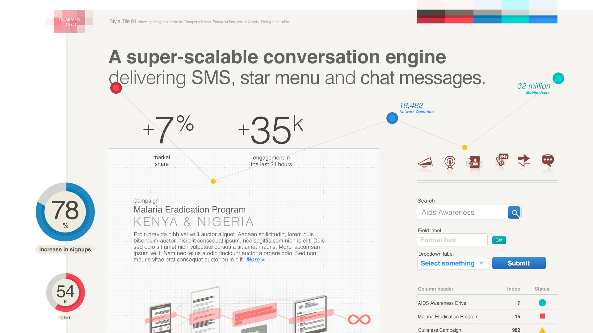
A style tile is a graphical artefact used to explore possible styles for a digital product. A designer gathers a representative sample of elements (buttons, icons, text) from the product which they then style and present to their client for an quick and easy idea of how their product could look. It’s not as rough as a mood board and not as detailed as a mockup.
They were developed by Samantha Warren when she realised full mockups were taking too long to produce and moodboards didn’t accurately capture the design direction.
The style tile itself is traditionally a flat, non-interactive image that will be used to guide the rest of the graphic design process. Created at the beginning of this process, it is meant to be quick and rough – it’s the graphic equivalent of a wireframe.
Each style tile shows a different personality though its visuals. One may show a set of elements styled in a boldly modern way while another may show the same elements styled classically. Clients will then choose which style tile they think will work for the product and target user.
For most projects you will need a set of three different style tiles for clients to choose from, but if they already have a strong visual style then one should suffice.
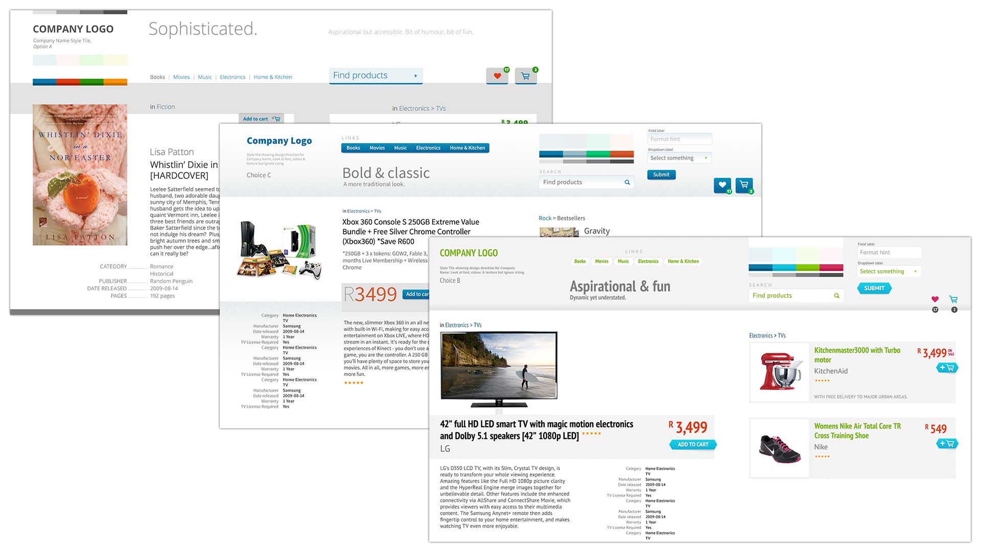
Three variations of styles tiles for single project
When to use style tiles
Style tiles really come into their own when clients don’t have a very strong design language, or when their branding has been designed print-first and needs to be tweaked a bit for the digital space. You should develop them at the beginning of the graphics phase to explore the brand.
Why you should be using style tiles
The power of style tiles come from their speed and flexibility. They allow you to produce a set of rough designs in a few days without having to mockup a full page, a complicated process often fraught with technical constraints. Creating a style tile is meant to be fun, and a happy designer means a better experience for users.
And while as designers we have an amazing talent for visualising a product, it can be hard for clients to do this. Style tiles help them to easily visualise their product, and make them feel more confident in their decision. Often clients just need to be sure that their direction is the correct one.
Who should use style tiles
Style tiles can be as complex or as simple as you like. They are most often used for clients who want to modernise, clients who have weak digital guidelines, or are just transitioning online. They’re also useful for clients who are launching a new product and need to assess how their users could emotionally experience their product.
The value for designers lies in their speed – perfect for tight deadlines. You don’t want to design something that the client may not think suitable. Style tiles means you can design something rough and get feedback quickly and early. Iteration is always the key to good work. They are particularly useful for designers who need to make a cohesive design language for many pages but don’t have time to mockup full pages.
How to design style tiles
First, take a step back and examine the space in which the brand exists. Who are its relationships with? How is the brand viewed but users, clients and competitors?
Then ask the client to give examples of sites they like. Look for patterns in those examples. How would you describe the brand to someone else? Take note of the words they use to describe it – these words form the basis of a language that will become common to user, client and designer. A sparse site could convey class just as it could convey coldness, or blandness.
When you become a designer, you learn to communicate ideas through a visual medium. A designer can look at a product and be able to perfectly describe it. A client hasn’t had the same training so needs to be helped. That’s the job of the designer: to teach the client how to describe the product in their head.
And never forget the user. A designer can’t tell the user what they learnt from 15 years of graphic design, just as users can’t tell designers how they view the world. It’s a designer’s job to be constantly monitoring how people experience the world and design for that. It’s the reason design carries such a responsibility. Imagine if you had to read the Constitution in Comic Sans.
Next, boil the brand’s idea down to a short sentence. Keep around 7 descriptive words in your mind describing the brand.
Find examples for across the web which exemplify this concept. Put these examples on a digital mood board.
Get examples of elements from the client’s existing product, competitor sites, or your wireframes or prototypes. Paste these into a 16:9 horizontal page.
Now comes the part where you actually make the style tile. Hide the elements and place the brand’s logo in the centre by itself. Make a palette which works with the logo. Add text and icons. One-by-one recreate the elements (or better still copy them from a previous style tile), quickly building a cohesive design language. Experiment and have fun! Explore the ways a brand could be expressed within those elements. Should the button use the same colour as the logo? Does a large photograph belong work next to a big block of colour? Just how colourful could the elements be before they interfere with the content?
The first style tiles you make will take what feels like forever. You won’t know what you are doing – that’s normal. The idea is to quickly explore, so messiness is part of the process.
Presenting styles tiles to clients
Style tiles should always be presented in person, preferably to only 2-3 clients. Fewer clients means you can accurately read the client’s emotions, which is important for getting good feedback.
The first step is to introduce the concept with plenty of examples. “This is a style tile. It is graphic that shows a possible direction for your product. It consists of fonts, colours, textures, and UI elements but is not layout, sizing, content, mockups and certainly not final.” Telling them what style tiles are not is very important.
Then it’s best to give them some guidelines for giving feedback, especially for less savvy clients. “Don’t get stuck on the details. How do you think your users will respond? Is there anything they won’t like? Which elements stick out?” They will appreciate being given a vocabulary to express how they feel about the style tiles.
When it comes to presenting, I’ve found the best is to sit the lead client down in front of a device (phone, tablet of laptop) their users would use and show them a style tile. Give them a minute or two to think about it. When they look like they are ready to talk, ask them “How will your user see this?” It’s important to remind the client that this is not about them, but about their users. If they don’t like blue but their users do, which should they choose? The one that will make them the most money of course. Do your best to keep them focussed on how their users would experience it. Be mindful of their situation – they may have bosses or marketers who they need to answer to.
Remind them know that it’s important that give an honest description of what they think about the style tile. They need to be comfortable enough to ask questions. “Why did you choose red for that button? What if you made it blue? Did you try another options?”
Be sure to focus on reading the client’s facial expressions for the truth about how they feel about certain elements. If a client isn’t exactly forthright, or cannot explain what they think about a style tile then ask them “How would you describe this…” while you point to a button. If that doesn’t work, say “Would you describe this as bold? Soft? Premium? Approachable?” Try to evenly weight your questions between “positive” and “negative” descriptors.
Sometimes you may encounter a difficult client who either doesn’t get the process or just doesn’t like the output. I once had a client who kept on thinking the style tiles were full page mockups and no amount of reminding helped. In this case, you could try breaking the elements onto separate pages and introducing them one-at-a-time.
Helping a client choose a style tile
If a client isn’t 100% happy, then choose the best style tile and iterate on that until there is consensus. Sometimes he may like the buttons from Option A with the font of Option B. This is ok, as long you you can pull them together is a cohesive way.
Once the client is happy that this is the direction he wants to go, you can take this and use it to design full pages. Start with the most important page first – usually either the homepage, article or product page.
The downside of style tiles
We’ve had enormous success with style tiles but they are not without their flaws. Although they will save you time in the long run, it can be difficult to get some clients to understand the reason for the exercise.
Style tiles are not inherently responsive, although they can be. Because they are so rough, you could quickly mockup the way elements would look on all screen sizes.
Lately we’ve become increasingly aware of the break between graphic design and front-end development (FED) which means that a dev essentially has to recreate everything he sees in the graphics. We are experimenting with doing style tiles in a WYSIWYG editor like Macaw or Adobe’s Edge Reflow.
We’ve done about a dozen sets of style tiles and they’ve been very successful. They work because they get both designers and clients pointing in the same direction and make the rest of the graphic design process much smoother.